Understanding Complementary Colors
You don't need to be a designer or expert to understand color theory. Here's the simplest way to learn all you need to know about complementary colors in photography and filmmaking.

What Do We Mean By “Complementary”?
complementary
/ˌkɒmplɪˈmentəri/
different but useful or attractive when used together.
Think of it like this: Two colors, who are not the same but still work well together. This can be any color on the spectrum as long as it has a counterpart that works with it, in harmony.
How Do I Know Which Work Well Together?
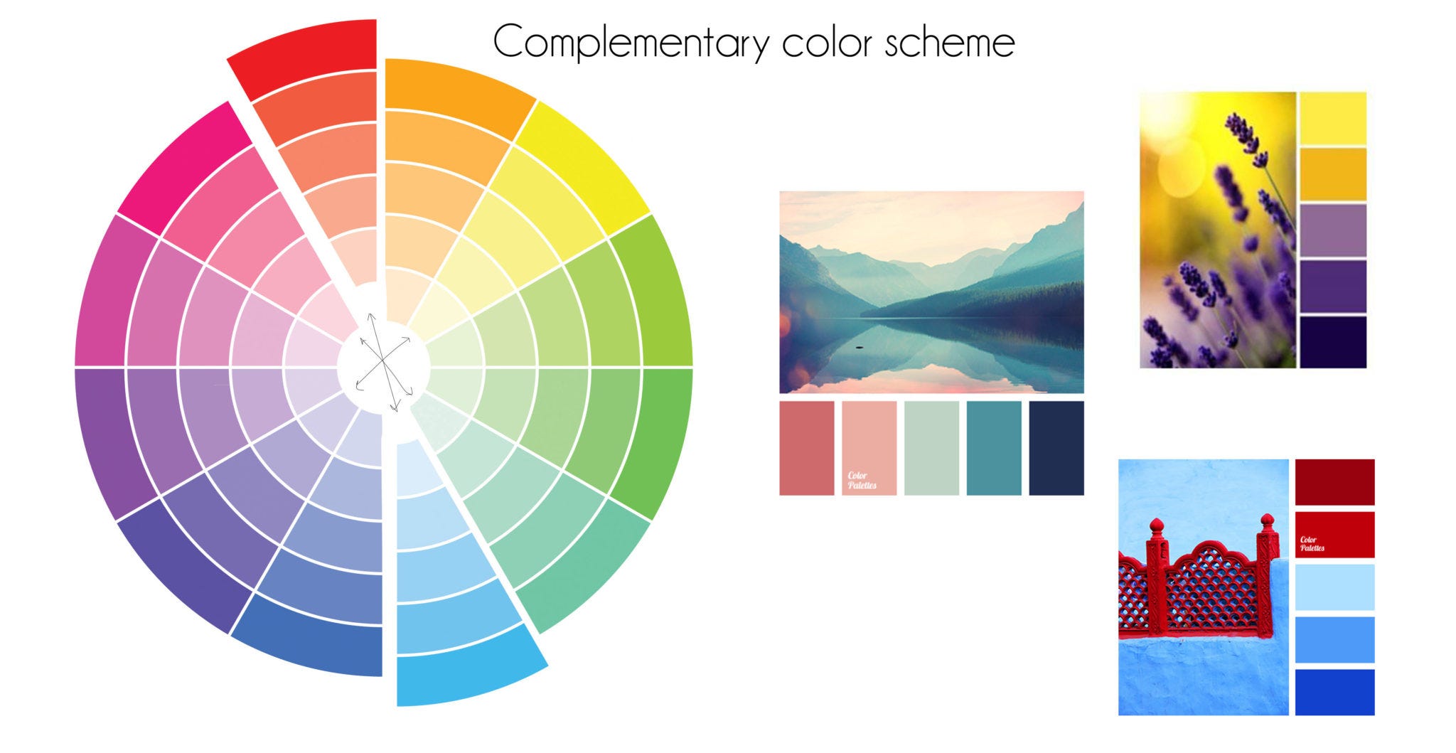
The easiest way to approach complmenetary colors is to look at a color wheel, like the one above. Let’s say you pick the color red. The complimentary counterpart to the color red would be blue.
Or in other, more simplistic terms - the complementary color will be on the opposite side of the color wheel.
Meaning, for red we got blue.
For green, we got magenta.
For yellow, we got purple.
And so on.
By using a color wheel, you can easily create your own color palettes that you wanna work with, whether it be in design, photography, filmmaking or anything else visual.
How Do I Create My Own Palette?
I use Adobe Color Wheel. It gives you various options, such as complementary colors, analogous, monochromatic, compound and many more.
What you do is simple: You pick a starting color on the color wheel and Adobe will highlight and show you all various colors you can use, to complement your choice.
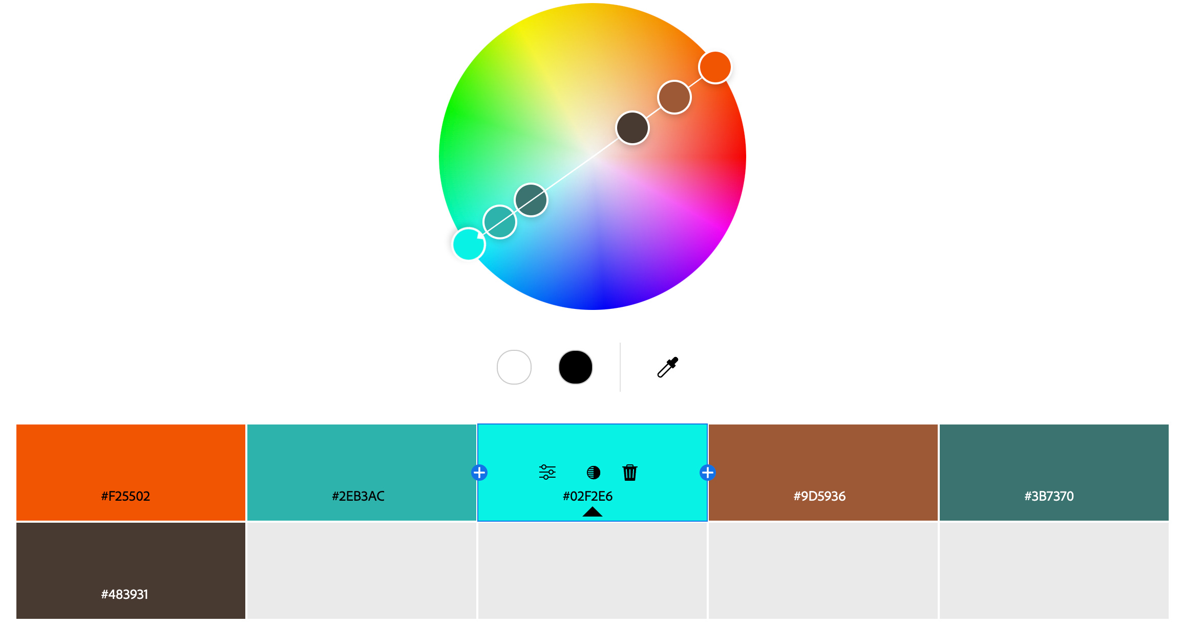
You’re also instantly provided with the code, which you can copy paste into whatever software you’re using, to instantly get the correct color for that project.
And if you’re working with a client and want to show them an “example color palette” that you put together, simply click the download button, or save the palette in a list - and you will be provided a JPG of the color palette that looks like this
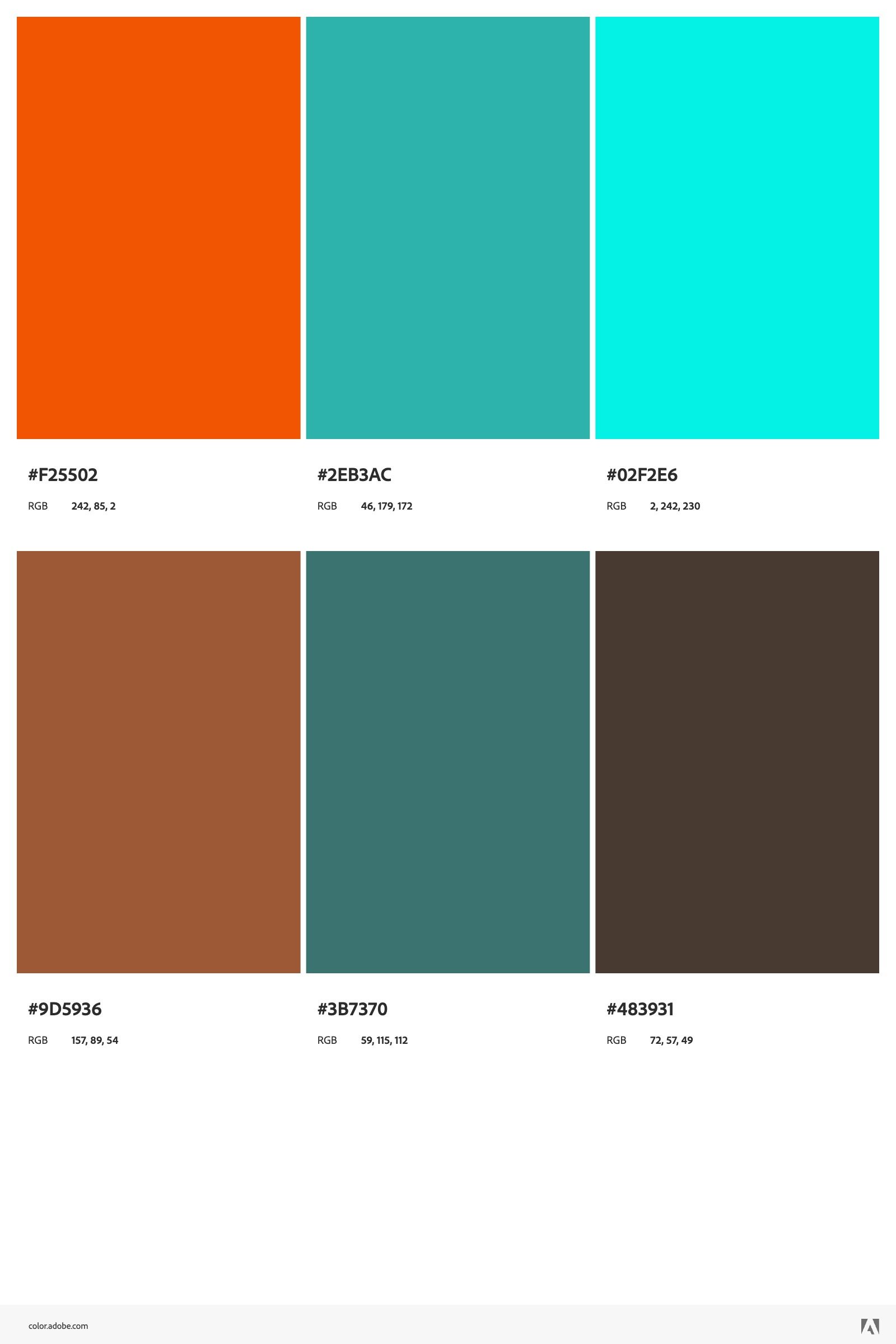
Pretty neat, huh?
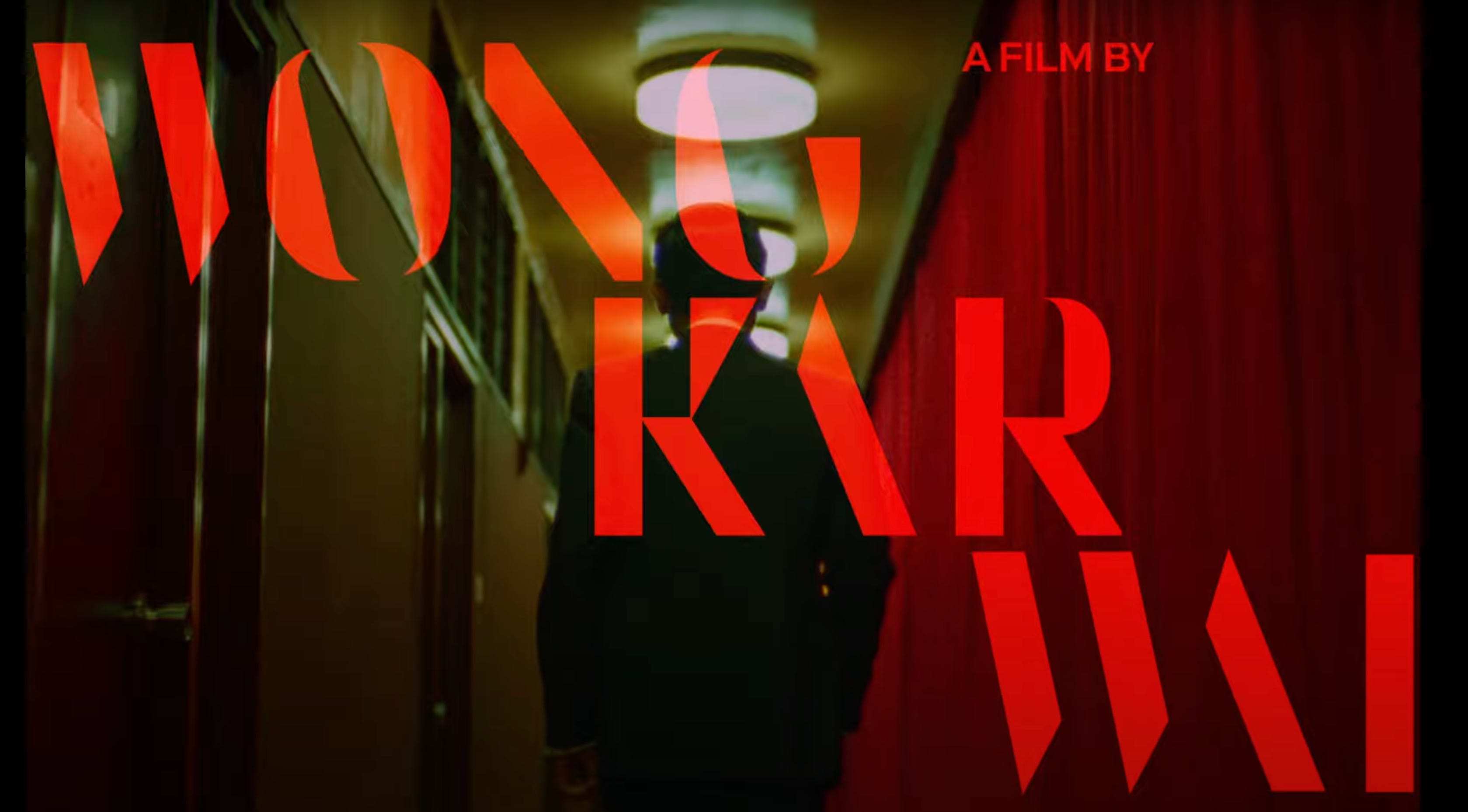
Inspiration From Film
When we watch movies, we can easily become awe-struck at all the beautiful colors in the set design and color grading process. Finding the exact palettes for that particular film is easily searchable. Just by searching Pinterest for “film color palettes”, you get results like this:
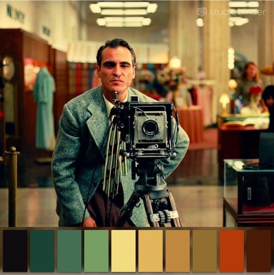
The Master, Paul Thomas Anderson (2012)
You Don’t Need To Be a Designer
Working with color can be scary if you’re not used to it. You might think I don’t have any background in design and it could easily scare you away from even trying.
But what you’re reading here is a great starting point (guess what? I’m no designer either). It’ll help you see more clearly which colors work well together.
The next step is to pay good attention to photography and films and really look at the color grading as you’re taking it all in.
This will further train your eye to see color in a completely different light.
Practicing
Finally, if you’re working in Lightroom or DaVinci Resolve (or any equivalent) - try these things out:
Color correct your image or video so that it looks fairly “normal”, as a base starting point.
Use the color wheels in the software to start adding color to create a style.
Always use references.
Meaning, keep a reference photo of a film or photograph next to you while you edit. Look at how the shadows in that reference photo are colored. The midtones. The highlights.
By color grading or retouching those specific areas, you will eventually end up with a style that resembles the one you have as a reference.
And if you’ve come this far but are worried you don’t know anything about using color wheels, understanding shadows, midtones and highlights, don’t know how to use any software, then read on…
Use Free Software
Lightroom Mobile is a good starting point, as it comes with a free version that doesn’t include any fancy effects (which, frankly, you don’t even need).
Don’t invest crazy amounts of money into a software if you don’t know how to use it and you know you will just temporarily be interested.
Lightroom Mobile is good to have due to it’s free option but also because it directly translates to the desktop version.
Meaning, if you know one version, you’ll have a pretty good understanding of the other.
If you want to learn color grading but don’t know where to get started - you may check out my (top-rated) Lightroom Mobile course that teaches you absolutely everything about Lightroom Mobile in 3.5 hours. The tools, the workflow, the color grading and creative stuff, as well as creating your own presets which you can re-use or sell at a later point.
Make sure to grab it when it’s on a special discount (which on Udemy, always is the case).
See the short trailer by clicking below.
What Are Your Sources For Inspiration?
Your favorite movies, photos or other art that uses particular colors you enjoy? Describe it to me and feel free to share examples.
I personally love the movies by Wong Kar-Wai, whose color palettes have been of great inspiration to me back when I was a film student.